Table of Contents
What Is Above The Fold?
Definition: Above the fold is defined as the top half portion of the newspaper or a website that is straight away visible to the visitor. Above the fold is considered important because it is the first thing that catches its audience or reader’s attention.
Above the fold is the top half of a newspaper’s front page, which is also visible when it is folded. In terms of the website, it talks about the content a site visitor sees before scrolling down.
Previously before digitalization, the idea of above the fold was only applicable to the newspaper. It was the term used for the headline and content that used to appear on the top half of the newspaper.
A lot of due consideration was to be made to publish lead stories that used to appear above the fold. It is because of its visibility that attracts the readers to read the whole content. Catchy headlines and attractive images were used to grab the attention of the audience.
With the introduction of technology and globalization, the term now covers informative websites.
Above The Fold In The Website
Nowadays, above the fold is predominantly important in the website or webpage. On the website, it refers to the top portion that is visible without scrolling down.
When it comes to the content layout and placement, it is difficult to determine the suitability of the pixel size. It is because the screen size varies drastically. There is no specific definition for the number of pixels that define the fold. Hence many websites have to adjust their layout according to the size of the browser window.
The resolution for the mobile devices also has to be adjusted. Nowadays, many people access a website through mobile phones. The users of the mobile phone prefer portrait mode to landscape mode. Hence, turning the traditional web page design sideways.
Where Is the “Fold” On a Website?
For a website, the fold line is around 1,000 pixels wide and 600 pixels tall. It is considered a best-case scenario, as it fits well with the most common monitor/browser combination of 1024×786 pixels.
All in all, when it comes to the use of fold on a website, you should remember that engaging and important content should be placed higher on the page and optimized for usability.
The right use of fold content helps in influencing user behavior and encouraging them to scroll down the page.
Importance Of Above The Fold in Web Design
Above the fold, it is important and essential due to its high visibility, which helps the audience determines to access the whole content. Hence the content that you display above the fold should help the publisher to achieve their goal. The content should be catchy and attractive to grab the user’s attention. The audience should not bounce back.
While advertising for a product or service, the publisher can place ads above the fold to improve its visibility. And which results in generating more ad revenue than the ads placed in other locations.
Best Practices Of Above The Fold for Website Design
Given below are some of the best practices above the fold in a website or a webpage.
1. Simple Design
For the content to be displayed above the fold should have a simple yet unique design. Please don’t make it flashy or make it look unprofessional. At the time of designing the content, ensure that it blends well and complements the website.
2. Impactful Call To Action
When it comes to advertising, the content should have an impactful call to action. Making the content unique and motivating will drive the audience to click on the content.
Using CTA in above-the-fold of your site is useful in telling your visitors what you want them to do.
3. Engaging Content
There are millions of contents out on the internet. One of the ways to make the content unique is by making it more engaging.
When the publisher decides for the content to be displayed above the fold, select a suitable headline and image. The headline, text, and picture should echo the publisher’s voice.
The H1 and tagline of your homepage should be clear, concise, and compelling.
4. Designed According To The Audience
At the time of publishing one’s content above the fold, design it in an easily readable manner.
The fold design of your website should be based upon the behavioral inclinations and tendencies of your site visitors.
5. SEO Considerations
Though it is important to place your ads above the fold for optimizing their visibility but overdoing it may also have negative consequences, as Google has updated its algorithms to penalize sites that use so many ads above the fold.
Few Examples Of Above The Fold Content
There are many sites where half of the front is adeptly used to boost content marketing and optimize conversion rates. Website pages folded in half as per the changing screen sizes and screen resolutions are quite effective in connecting with audiences or visitors as per their user behavior.
Let us have a look at some of such websites where visitors can just see the top half to know about the most important content of the site and help the site owners with higher conversion rates-
1. Shopify
Shopify helps in promoting the e-commerce business of the various entrepreneurs. The image and content placement displayed above the fold invites the audience to explore the website.
2. Wistia
Wistia allows publishers to create dynamic videos for marketing and advertising campaigns, and its above-the-fold design highlights this feature.
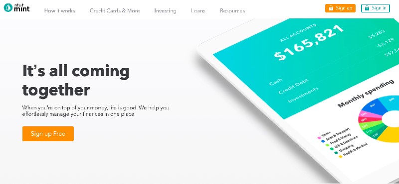
3. Mint
Mint promotes simple yet professional design for the above-the-fold content that maximizes the use of simplicity in the fold content.
4. ProBlogger
The homepage of ProBlogger has a lot of calls to action. It consists of several links for a different range of social media platforms.
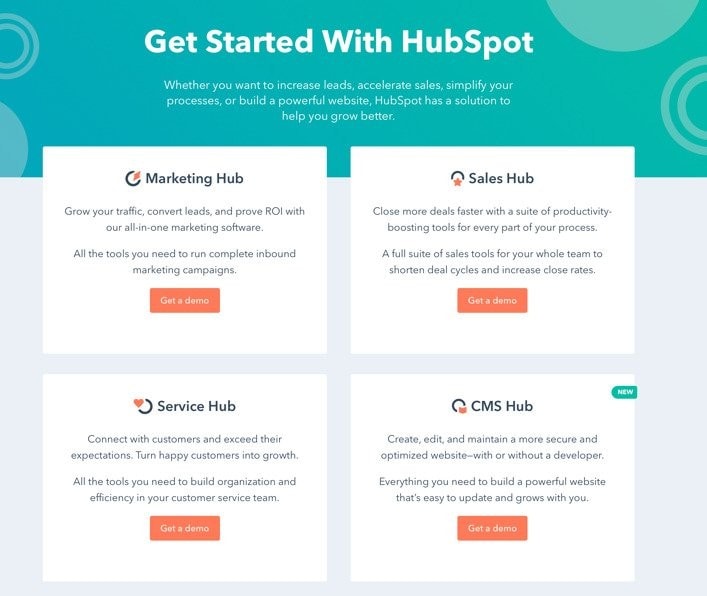
5. HubSpot
The fold content of the HubSpot home page shows their ways of using homepage headlines for telling visitors about how to get started with HubSpot.
Wrap Up!
On the concluding note, it is clear how effective fold content can be in connecting and engaging with site visitors to optimize conversion rates.
Your site’s above-the-fold content is the first impression of your site that your audiences see when they land on your site. Therefore it has to convey what you do and what your USPs are in a way that it can inspire your site browsers to explore the rest of the parts of your site and its offerings.
How important do you consider above-the-fold content in the optimization of a business on the web and conversion of more customers?
Liked this post? Check out the complete series on Digital Marketing
