Table of Contents
What is Brand Identity?
Brand identity is a unique set of characteristics that distinguish one brand from another. Brand identity includes visuals such as logos, colors, typography, and slogans; but also touchpoints such as customer service and product quality. Brand identity is the total of how a company wants its customers to perceive it.
A brand identity is what makes a recognizable brand. Brand identities are often seen in the form of logos, colors, fonts, and other visuals. Brand identity should be consistent across all of a company’s platforms to portray a unified message.
Brand identity is important for businesses to set themselves apart from the competition and build customer loyalty. Brand identity helps customers recognize your company and its services at a glance, and makes it easier for them to make an emotional connection with your brand.
Brand identity also helps you establish trustworthiness, credibility, and professionalism. A good brand identity will ensure that customers come to you for their needs and will continue loyal to your brand despite the competition. It will also help you establish a strong presence in the market and make it easier for customers to find and remember you.
Having a coherent Brand Identity is essential for any business, no matter its size or industry. Brand identity can range from simple visual elements such as a logo or slogan to more complex elements such as customer service and product quality. Brand identity should be consistent across all platforms to portray a unified message.
Creating an effective Brand Identity takes time and effort, but the payoff is well worth it. With a strong Brand Identity, your business will stand out from the competition, establish trustworthiness and credibility, build customer loyalty, and gain a strong presence in the market. Brand Identity is essential for any business wanting to succeed in today’s competitive landscape.
13 Brand Identity Examples
1. Apple
Apple is one of the most recognizable brands in the world. Their brand identity example is very strong with its minimalistic aesthetic and iconic logo.
Apple’s “Think Different” slogan, along with its strong branding strategy has led the company to be known as an innovative force. A great example of this is seen in their ‘Shot on iPhone’ ad campaign.
Apple’s Brand Identity is largely based on its iconic logo, which has been used since the company was founded in 1977. The logo itself is a minimalist design of an apple with a bite taken out of it. This simple yet effective design has become synonymous with the brand and is recognized worldwide.
Apple also uses colors like white, black, silver, and gold to further emphasize its Brand Identity. These colors are used across all of the company’s products, from iPhones to Macbooks and other devices.
2. POP Fit
Not only is POP Fit’s brand bright and beautiful with pinks, purples, and yellows, but the radical representation found in all their messaging is stunning.
POP Fit Clothing wants everyone to feel included and believe that representation matters, which is why their sizes go from XXS to 4XL. Their clothing is made with stretchy fabric so that it’s comfortable for people of all shapes and sizes.
Images on POP Fit’s website are un-retouched and show diverse models realistically and respectfully, supporting the company’s inclusivity message. Women of color, wheelchair users, and people with diverse body types are all featured prominently.
POP Fit’s Brand Identity is also reflected in its logo, which features a feminine figure wearing bold colors and standing tall with confidence. This Brand Identity is also seen in their Brand Story, which features people of all different sizes and backgrounds.
3. Dropbox
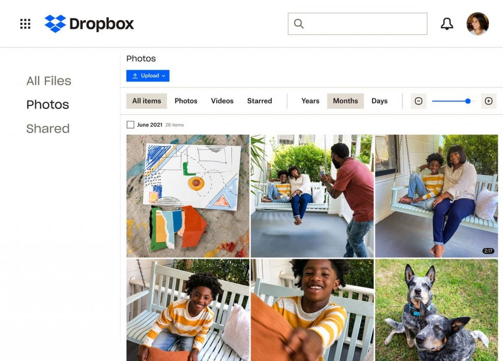
Dropbox is an excellent example of a brand with a minimal identity design. Their colors are very limited, and most designs only use 2 or 3 colors.
One thing you’ll see with this brand’s identity is how the design changes based on the platform. For example, Dropbox uses different shades of blue for its desktop and mobile app brands.
This is a one-of-a-kind digital brand identity design. It’s strong, clean, and straightforward. It chops off any distractions and gets straight to the point.
Dropbox also has an iconic logo, which features a paper plane flying in the sky. This logo is simple but instantly recognizable, making it great for Brand Identity.
4. Coca-Cola
The Coca-Cola company is one of the most popular beverage providers in the world. Not only is it known for its delicious drinks, but also for its iconic branding. The red color and classic ribbon imagery are both synonymous with the Coke name, and their “Share a Coke” campaign was hugely successful.
Coke’s red logo and script typeface inspire confidence and a sense of enjoyment in drinkers. Coffee is usually had before work to jumpstart the morning, whereas Coke is more commonly enjoyed at the end of the day as a way to wind down. This forms the “face” of Coke’s brand identity.
By Coca-Cola printing its logo on a uniquely shaped bottle, it tells customers that they are not getting an imitation. Instead, they are receiving authentic products. Furthermore, by developing credibility and trust in this manner, the brand becomes more reliable in the eyes of consumers.
5. Adidas
Adidas is known for its Brand Identity based on its “Three Stripes” logo. This iconic image has been used by the company since its inception in 1949 and is instantly recognizable. It’s also been adopted by athletes everywhere as a sign of performance excellence and style.
Adidas’ Brand Identity is further highlighted by its use of black, white, and red colors that make up the “Three Stripes” logo. These colors have become synonymous with the brand, and they’re used consistently in all of its marketing materials.
The Brand Identity is also reflected in the products themselves, as Adidas focuses on creating high-quality athletic apparel that appeals to athletes and fans alike. From shoes to shirts, jackets, and shorts, Adidas ensures customers get a product they can trust while looking great doing it.
6. Firefox
In 2019, Firefox decided to focus its rebranding on a digital design that would represent the company well. The agency in charge of this process was Ramotion.
Firefox’s goal was to create a universal branding design that would attract younger generations, as well as people of different cultures, genders, and backgrounds. This was a comprehensive redesign that included changes to its branding design, from the logo to icons and app user interface designs.
The most distinguishable change was the introduction of geometric shapes they named “atomic particles” to the visual branding identity. These vivid atomic particles are part of making the brand attractive to younger generations while still representing the brand’s core concepts. The “Firefox fights for you” campaign was the first to utilize it.
The design agency reported that Firefox’s new product launch was successful, in part due to the creation of a fresh visual system and guidelines shared across its entire company.
7. Burt’s Bees
Burt’s Bees is a company that focuses on natural beauty and personal care products made with all-natural ingredients. Its Brand Identity is based on its commitment to sustainability, health, and the environment.
The Brand Identity of Burt’s Bees centers around its iconic bee logo, which is widely recognized throughout the world. It’s known for being simple yet stylish and conveys a message of quality without any fuss or frills. The bright yellow color and black lines evoke feelings of optimism and energy as well as emphasize their commitment to nature.
The company’s original logo, which showed the bearded founder, was very simple and unassuming. This is different from most other beauty and personal care products that are flashy and have many colors.
8. Oatly
Oatly, a milk-alternative company, has made waves with its unconventional marketing strategy that focuses on health and sustainability. Even though they had a limited budget when they first started, they found creative ways to get their message across.
We’ve all been there. You’re sitting at the breakfast table, and you find yourself reading the back of a cereal box or milk carton.
Oatly went for a more maximalist approach with their packaging, utilizing it as their primary marketing channel. This is what we like to call “packvertising.” There’s a lot of text on the packaging, but it all effectively communicates their brand values.
Oatly is an activist brand with a transformation into a fearless challenger brand. They rebranded in 2012 to appeal to a wider, more environmentally conscious audience. Now their slogan is “Wow no cow!” which drives home the point that milk comes straight from plants, not cows.
The Brand Identity of Oatly is all about being bold and unapologetic. The bright colors, typeface, and logo communicate their mission of making a positive impact on the world. Oatly’s Brand Identity is a reflection of how they want to be seen in the marketplace.
9. Airbnb
Airbnb is a business that connects people around the world to accommodations and experiences through its online platform.
Airbnb has transformed not only the way we travel, plus it has also changed how brand design is executed. Every asset and element was changed to reflect the new identity, starting with the ‘Belong Anywhere’ creative proposal.
The new identity logo design became a proud symbol of Airbnb’s values and community. The Brand Identity is built around the “Bélo”, which symbolizes belonging, acceptance, and hospitality.
Airbnb’s Brand Identity includes a warm color palette, playful icons, and a typeface that conveys positivity. All of these elements come together to create a Brand Identity that communicates trust and approaches the world with warmth and optimism.
10. Netflix
Netflix is an entertainment streaming service that has become one of the most popular content providers in the world. The Brand Identity of Netflix is built around its iconic red logo and the “N” icon that adorns the Netflix website and most of its marketing materials.
The Brand Identity of Netflix is built around the idea of an inclusive viewing experience. It conveys a feeling of being connected and part of something larger, with everyone in the world having access to the same content regardless of where they live.
The Brand Identity also includes modern, minimalistic typography and a vibrant color palette. The typography communicates intelligence and sophistication while the colors are meant to evoke emotion and energy.
11. Casper
With over one million sleepers, Casper is quickly establishing itself as the go-to mattress brand. A big reason for their success is due to their cohesive branding that perfectly lines up with the company’s personality.
The logo is kept simple while the color scheme of blue and warm beige tones are carried throughout the website design, photos, and other visual elements.
Casper’s commitment to great product design extends to its packaging as well, with a minimalistic blue label that is instantly recognizable.
12. Mastercard
The Mastercard logo is globally recognized and consists of two interlocking red, yellow, and orange circles. It’s iconic and instantly recognizable.
Mastercard’s brand identity extends beyond the logo. Brand elements such as colors, typography, and photography are used to create a consistent look and feel across all of their products. Brand guidelines are in place so that each element is used properly.
Mastercard’s brand center is a great example of how to keep branding consistent using similar designs for the company’s various payment brands with different color schemes to reflect their unique identities.
13. PayPal
In 2014, PayPal underwent a brand identity overhaul with the help of fuseproject. According to fuseproject’s reasoning, PayPal updated its identity to better reflect its innovative side and position as the leading digital payment company, similar to how Mastercard did.
Not only does PayPal strategically place its logo on credit card readers, but this also allows for full alignment of the company’s brand identity across digital and physical products.
Logo Centers are an innovative way that PayPal has come up with to not only ensure brand consistency but also provide companies with a lot of visual tools and badges. These let their customers know that they accept PayPal payments, offer free return shipping for those who use PayPal checkout, and more. All of this serves as on-brand promotions for PayPal too.
What can we learn from these Examples of Brand Identity?
From these memorable Brand Identity examples, we can learn some key lessons. Firstly, it’s important to design a logo that is unique and instantly recognizable across all channels.
Brand visual identity elements such as colors, typography, visuals, shapes, and even brand messages should be cohesive so they create a consistent look and feel throughout the entire brand image. Brand guidelines are essential to ensure Brand consistency and to make sure brand assets are used appropriately.
Additionally, brand identities should be updated as necessary to keep up with modern trends and technologies, such as when Mastercard and PayPal updated their Brand identities for the digital world.
Brand identities should also be designed with the target audience in mind to ensure greater Brand engagement and loyalty. With a cohesive Brand identity, a successful Brand strategy can be created that will create a memorable Brand image and stand out from the competition. Brand Identity examples provide great insights into how to craft an effective Brand identity for your own Brand.
Conclusion!
Ultimately, having a consistent brand identity is essential in creating a memorable and instantly recognizable presence. Brand identity examples such as Apple, Nike, or McDonald’s are easily distinguishable due to their striking visual identities.
If you’re looking to create an effective brand strategy that grabs attention and stands out from the crowd, start by establishing a recognizable brand identity.
A well-thought-out, cohesive set of colors, fonts, and imagery can go a long way in creating an effective and memorable brand presence. With the right approach, you can create a unique visual identity that helps your business stand out from the competition.
Liked this post? Check out the complete series on Branding
