Table of Contents
What is Brand Style Guide?
A brand style guide is a rulebook that acts as a reference for creating a unified brand identity, helping your team ensure brand consistency across all products and platforms. It defines the look and feel of your brand which can then be shared internally between partners, media and agencies. Brand style guides provide marketers, designers, and other professionals with logo guidelines, design elements, primary brand colors, and more so they can create a great brand story.
Brand Style Guides are like a playbook for how to use your logo, colors, fonts, imagery, voice, and tone — in other words, it explains the ‘rules’ for how to effectively communicate your brand.
As a rulebook, it outlines your brand’s overall look and feel, and how to use that consistently in all of your marketing materials. It also sets rules for how you should talk about and represent your brand so that it is represented accurately and consistently across all mediums.
By having a Brand Style Guide, you can ensure that everyone involved in producing your brand’s marketing materials has a clear understanding of how to accurately portray and represent your business. This helps create trust with customers and develop customer loyalty over time.
The purpose of a Brand Style Guide is to promote brand consistency across all physical and digital platforms. It outlines how your brand’s logo, secondary logos, design elements, visual brand strategy, primary brand color, and other components should be used by both internal staff and external partners.
As a brand manual, it helps ensure that each touchpoint accurately reflects your company’s brand and values. Your Brand Style Guide should include everything from your logo’s size, color, and placement to typography guidelines, visual identity, imagery styling rules, and more. It should also guide designers and marketers on how to use specific elements such as buttons or other design elements to ensure a consistent look and feel.
Why are brand guidelines important?
A few key reasons Brand Guidelines are important to include
Brand consistency
Brand style guides help everyone involved in producing your marketing materials to understand how to accurately represent and portray your brand. This helps to create trust with customers, which leads to customer loyalty over time
Brand protection
They also assist in protecting the integrity of your brand, as it ensures that all communications are consistent and accurate
Brand recognition
Brand guidelines also ensure that your brand is recognizable and memorable. When customers recognize your brand, they’re more likely to remain loyal to it over time
Brand differentiation
Brand guidelines also help you stand out from the competition by creating a unique look and feel that sets you apart from others in your industry.
Brand trust
Brand guidelines can also help to build trust with your customers, as they show that you care about the representation and accuracy of your brand.
Elements of a Brand Style Guide
1. Mission Statement
A mission statement is a brief overview of your brand’s purpose and values. It should include the core values that drive your business and explain what sets you apart from the competition.
2. Buyer Persona
A buyer persona is a semi-fictional representation of your ideal customer. It includes demographic information, psychographic traits, goals, and pain points. This helps you to create content that resonates with your target market.
3. Color Palette
Your Brand Style Guide should include a color palette that outlines the primary, secondary, and accent colors of your brand. This ensures that all visuals used in marketing materials are consistent and on-brand.
4. Editorial Style Guide
An editorial style guide is used to set rules for writing style, grammar, punctuation, and content formatting. It also outlines the “tone of voice” your brand should use when communicating with customers.
5. Typography
Brand typography sets the tone for all visual elements of your brand. It should include rules for fonts, font sizes, and font colors.
6. Brand Story
Brand stories help customers to connect with your brand and create an emotional bond. It should provide an overview of the history, values, vision, and mission of your business.
7. Brand Logo
Brand logos are a key part of Brand Style Guides. It should include guidelines for logo usage, including size, placement, and color variations.
8. Imagery
Brand Style Guides should also include guidelines for imagery usage. This includes rules for stock photography, illustration styles, and other visuals used in marketing materials.
9. Brand Voice
Brand voice is how you communicate with customers. It should include guidelines on the language and tone used in communications.
How to create a brand style guide
1. Find inspiration
Before you start creating a Brand Style Guide, it’s important to find inspiration from other brands in your industry. Take note of colors, typography, images, and content that resonates with you. This will help you create an effective Brand Style Guide that accurately reflects your brand.
2. Elements of a Brand Style Guide
There are six key elements of a Brand Style Guide. These include a mission statement, buyer persona, color palette, editorial style guide, typography, and other brand-specific needs.
3. Other Brand-Specific Needs
Depending on your business needs, you may need to include additional Brand Guidelines in your Brand Style Guide. This could include a logo usage guide, photography guidelines, and any other Brand Guidelines that help to define your Brand.
4. Outline & Build the Book
Once you’ve outlined the Brand Guidelines for your Brand Style Guide book, it’s time to build it. Use a design program or online tool to create a visually appealing Brand Style Guide book that reflects your Brand.
5. Plan for Evolution
Brand Guidelines should evolve as your Brand does. Make sure to plan for future changes and updates to ensure that your Brand Style Guide accurately represents your Brand over time.
Brand Style Guide Examples
Netflix
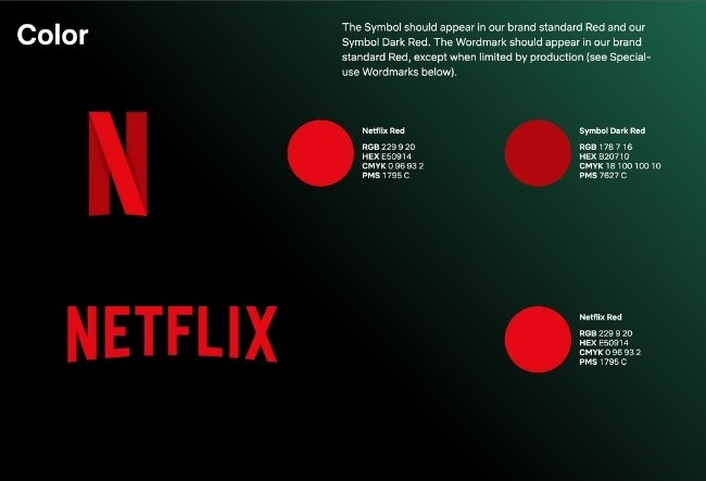
Netflix’s primary focus for its public brand assets is the logo treatment. Its style guide gives straightforward guidelines for how to size, space, and place its capitalized typeface alongside a single color code to create the red brand logo.
The company’s logo and “N” icon have become iconic symbols of the brand. Because most people recognize the brand by these alone, it doesn’t concentrate on too much in its online brand guidelines except for explaining how to use the logo and symbol correctly.
Your brand guidelines don’t need to be as comprehensive as your brand’s scope. Sometimes, the basics are all you need to stay in line and keep things running smoothly.
Google Marketing Platform
There are times when it’s best to combine two products into one brand. On July 24, 2018, Google came up with its Google Marketing Platform. The project succeeded in joining the DoubleClick advertiser products and Google Analytics 360 Suite together.
The goal of this new brand is to create a trusting and professional image while still maintaining the approachability that Google customers are familiar with. The company’s visual guide is a seamless blend of simplicity and stunning visuals that immediately gets the viewer’s attention.
The colors, fonts, and illustrations are consistent across the board and serve to create a visual language that speaks for itself. Google’s Brand Guidelines have a simple yet effective design that can be used as an example for any Brand Style Guide. The Google Brand Guidelines lay out the basics and offer a visually pleasing Brand Style Guide that is both easy to understand and implement.
NASA
As Brand Style Guide is designed to reflect the agency’s core values: exploration, discovery, and collaboration. The guide includes a detailed description of core objectives and its mission statement.
Brand guidelines also feature illustrations and photographs of NASA’s history, to help users imagine and visualize the space agency’s influence and importance. Brand standards are also outlined in the Brand Style Guide, including colors, logos, typography rules, and much more.
This guide is over 200 pages and includes detailed descriptions of logo placement, color usage, as well as supporting designs. Even NASA’s space shuttles have their own branded guidelines.
Audi
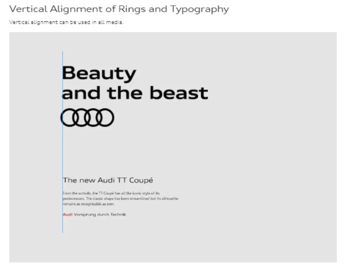
Given that Audi is a household name all across the globe, it’s no surprise that the brand is replicated and promoted in thousands of places. Audi’s Brand Style Guide provides clear instructions on how to use the brand assets correctly and consistently, to ensure a top-notch Brand experience.
Audi’s brand guidelines are different for user interfaces, corporate branding, communication media, corporate sounds, motorsports, dealer facilities, motion pictures, etc. There are even specific ratios and alignment rules that govern how the company logo can be used in any branding material.
Hulu
The guide defines Hulu as a brand that has a positive emotional connection that viewers have with Hulu content, which is driven by Hulu’s brand personality. Brand guidelines for Hulu include logo, Brand Typeface, and Brand Color Palette.
Brand principles, usage guidelines, voice standards, and messaging approaches are also included in the style guide. Hulu’s original, lighthearted, and congenial personality shines through its brand guidelines. The use of green and white hues creates a cohesive brand identity for Hulu.
As freelancers and media creatives work with Hulu’s brand voice, they’ll start to get a feel for it. The voice is confident, understanding, daring, and humorous. The company also provides examples of its illustration style, which gives graphic designers an idea of what Hulu’s brand is like. This way, they can create assets that accurately reflect the company’s image.
Mozilla Firefox
Firefox’s brand personality is confident, bold, and opinionated. They are proud of their openness, radicalness, and kindness. This Brand Style Guide is more than just a style sheet. It also provides amazing guidance to designers and marketers on how the Brand should be used. The Brand Guidelines cover color usage, typography rules, layout guidelines, logo usage, and much more.
Not only do the words that they use or the large font size make these bold statements, but also their brand colors. For example, Firefox’s analogous color palette of deep purple, bright orange, dark pink, and bright red are visual expressions of what their Personality section spells out.
Firefox style guide understands color psychology and hence becomes incredibly helpful for designers, businesses, media creatives, or any other professionals who need to work with Brand products.
WeWork
WeWork’s fundamental product is physical spaces where people can gather and interact socially. So it makes sense that their branding would be a comprehensive set of principles governing style, community values, and visual design that could also be applied to architecture.
WeWork has 848 locations around the world, but every space follows a similar interior design style. WeWork Brand Style Guide covers Brand visuals, Brand colors, Brand typography, Brand logos, Brand photography, and a range of other topics.
In contrast to other brands which may be digital like Waze or physical consumer goods, WeWork has excelled in its effort to create a consistent brand identity. Developing a comprehensive brand identity is no easy feat, as it needs to touch on everything from arts and letters to marketing materials, digital assets, architecture, and interior design. And that’s just scratching the surface!
Visa
Visa’s logo design is made to be easily identifiable, global, and modern. Visible online presence remains a top priority for the company as it continues representing itself through colors and iconic images that are easy for users to remember.
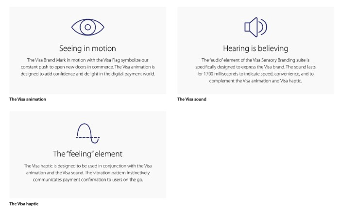
This brand guideline’s most unique characteristic is its sensory elements. Visa elaborates on the sight, sound, and haptics of its brand in an online setting. Keep in mind that because Visa payments can be processed through thousands of apps, a cohesive physical identity is key.
If you have an eCommerce or digital-only brand, sensory feedback might be key to your success.
Berkshire Hathaway HomeServices
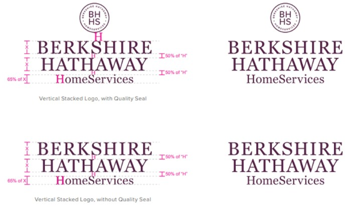
Berkshire Hathaway HomeServices provides top-quality tools to US buyers, sellers, and investors of luxury real estate. The brand guide is extremely comprehensive, including 106 pages on information like color schemes, brand tone, brand voice, etc. Additionally, it has pre-existing guidelines for physical objects such as yard signage, printed stationery, etc.
This style guide is so comprehensive that it covers every eventuality, to prevent any misunderstanding or misrepresentation. This is relevant for both online and offline interactions with the brand. Guides should always include both physical and digital elements to be thorough and provide more value as your brand develops.
Starbucks
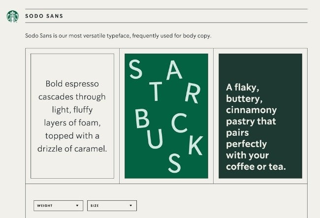
Starbucks’ interactive style guide comprises in-depth instructions on using everything from its Siren logo to its green color scheme. Furthermore, the guide gives a visual array of how their creative assets can be utilized on various platforms.
Brand Guideline also provides an in-depth explanation of the Brand’s voice, tone, and visuals. Starbucks’ style Guide focuses on how to use its Brand assets, like the Brand Logo, Brand Colors, Brand Typography, etc.
Tik Tok
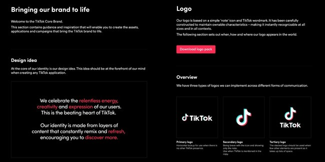
TikTok’s style guide is more than just a simple instruction manual. It’s an interactive brand book that shows how design can bring its brand to life.
Next, it provides an overview of its logo, co-branding, color, and typography. Its brand style guide suggests how different branding elements are supposed to be used by its users, who are creative and always express themselves.
Conclusion!
Creating a Brand Style Guide is an essential part of any successful brand strategy. It helps to ensure that all your marketing and communications efforts are consistent, professional, and memorable across different channels.
By having a Brand Style Guide in place, you can create a strong visual identity for your company that customers will recognize and appreciate. Brand values, font styles, and attributes to become recognizable brands are all elements that need to be considered when developing your own style guide.
Following a Brand Style Guide will ensure that your company is better positioned to stand out in the marketplace and reach your desired target audience with impactful messaging.
Liked this post? Check out the complete series on Branding

