Sales deck is also referred to as pitch deck, which is nothing but a sales presentation that allows the salesperson to share information related to the company and its offerings to potential customers and clients. It is usually a PowerPoint or Keynote for PC or Mac and is delivered to the customer in a face-to-face meeting. It has the facility to be printed and can be shared with the clients once the session is concluded. The name Pitch Deck is popular because it’s a part of the Sales pitch, which is delivered to someone to convert the customer and convince them to buy the products or services.
The sales deck is displayed as a series of slides with a mix of images, text, graphics, and essential statistics, which is designed to persuade and educate the audience. The ultimate aim of every sales deck is to have a conversion or a sale.
Table of Contents
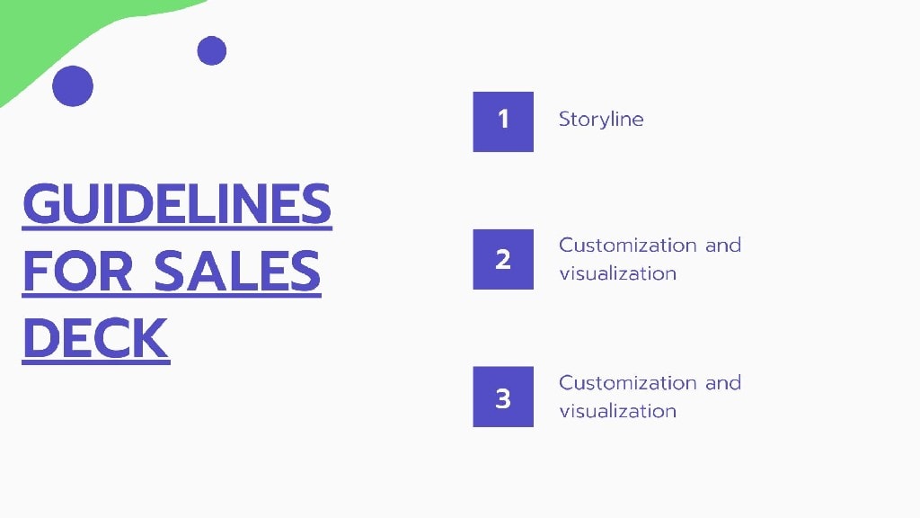
Guidelines for Sales Deck
Your Sales deck must be convincing to the customers. The customer understands the technicalities of the product, and if he wanted to listen only to the technicalities, he would have read the brochure by himself. There is a reason why a salesperson is involved in presenting the sales deck, and it is to humanize the abstract process.
Following are a few of the guidelines which should be followed while preparing the sales deck:
1. Storyline
Most of the sales deck fail because they are product-driven rather than being story-driven. As less as 5 to 7% of the prospects remember 5% of all the statistics and images that you have shown. On the other hand, the retention of the customers increased by 60 to 70% when stories are used instead of statistics. The customers are already overloaded with information from everywhere, and to stand out, you have to add a human element to the deck so that it is more relatable to the customer.
You have to understand the nature of your customer and design the story accordingly. If you are facing a customer who is a C-level executive, then you have to tell a vast strategic story. If you are facing a director, then you have to make your case by using a more pragmatic framework.
2. Customization and visualization
Customization has more results than generics. For example, a personalized email will have more clicks than regular email. These images also deliver six times higher transaction than regular email. Similarly, more than 65% of people understand best when they are conveyed visually. Visual presentations are 40% more productive and persuasive than text pointers. You have to customize your content according to the audience you are facing.
Irrespective of the storyline that you use, you have to remember to tailor your story and sales deck periodically and change it according to the customer. Using the voice of customers gives your presentation more credibility than using the product lines. The regular practice is dragging and then dropping logos so that you could take it while discussing it with the customers.
If you want to go a step ahead, then use the color of your prospect’s brand so as a theme throughout the presentation so that it is more convincing. The same presentation should be presented just by matching the colors of the brand of customer.
The use of visual metaphors also has a good response. Customers have to understand before they can decide on buying something from you. Many industrial product companies usually mess this up. Metaphors are handy because they can instantly grasp your prospect and make them understand what you are trying to do. Simple visual diagrams also help to convince the customer. Visuals are more efficient because research shows that our brains process visual information faster than text information.
Using iconography in your sales deck will also help to make the presentation more compelling. The icons are considered as conceptual, and they do some work to make the customer imagine the future of the product. You have to ensure to make the examples very concrete. Photographs and videos explain more than a text, and also customers can relate to the same in a much better way.
3. Flex formatting on Delivery method
Salespeople often run into this dilemma that their prospects ask for the presentation. The candidate asks for the presentation so that he can send it to his boss, and you are in a fix at that time because the prospect’s boss, who is the actual buyer, is never going to read the entire text document. Neither is he going to go through the presentation without getting confused.
You have to have two versions in such cases. The same text should have two different versions with 20 words per supplied for presentation and 60 per words per side if the deck is going to be ready. If the prospect spends five minutes going through a 15-page sales deck, then he has given only about 45 seconds for a slide. Considering the average reading speeds, it’s about 60-100 words per minute at the max.
It is also essential that this knowledge you establish on the side, the more you captivate the audience. More and more customers prefer seeing the content on their mobile devices because more than 40% of the customers are using mobile devices for purchases. You have to understand this and customize a presentation to make it more mobile-friendly to the customer. If your customer is using a mobile phone, then the matter of 60 words per minute halves down to 30 words per minute.
Examples of Sales Deck
1. Zuora’s Sales Deck
The sales deck from Zuora, which is a software company that provides tailor-made subscription-based services. There are many essential features in this software is commerce, finance, building, and the sales deck has the main image with minimum text, which has many thought-provoking statements, statistics, and facts. The vibrant image background will help to personalize and differentiate the brand from the competitor’s brand.
The Modernization of Zuora pitches the message in the more adapting way with the changing times. They position themselves as a perfect solution to their prospective clients.
2. Salesforce Sales Deck
Salesforce is one of the world’s number one CRM solution providers, as well as a sales cloud. These applications have completely changed in the way they communicate with customers. Significant companies of Fortune 500 use a salesforce marketing cloud sales deck to focus on high-level advantages of the product.
This Sales Deck is considered to be perfect if you have to simplify the sales process and the walk of your client down the sales funnel. Many complex processes are depicted in flow charts and diagrams with the help of images and text over there to make it easier to understand.
3. Uber Sales Deck
The prominent taxi service Uber has a professional-looking deck along with bold pictures and the big border with underlying text. Uber discusses its safety policies, management, and control of its sales deck. Many slides are created so that the focus remains on the central image and a text line.
This is why for few complex sides there will be no more than three bullet points or three boxes that will have that information. With compartmentalization of the deck content, it will help its customers to follow through the message to the last side.
Ending the sales decks with a powerful quote will help to leave a long-lasting impression and help you to visualize how your offering will be helpful to the customers.
4. Reddit Ad Sales Deck
Read it is considered as one of the largest social networking sites and it has a sales wreck with an image of a unicorn that is being ridden by a cat. They’re like to leave a long-lasting impact on their audience by sharing something unexpected. Reddit focuses throughout the deck on maintaining its brand identity to the customer.
It engages the customers and is not afraid to use a few pop culture images and jokes to get the message across. Reddit claims to stand out from the regular old annoying sales pitches at aims for the X factor in the customer.
Reddit sometimes uses another technique in which they draw their audiences away from the impressive data points. It is effortless for your customers to get beautiful round figures and help their audiences to measure how the offering can help them.
5. Snapchat Sales Deck
Disappearing photos, messages, and videos are the newest form of communication designed by Snapchat. It is a favorite amongst 12 to 30 years old. Snapchat has a very sophisticated user interface, and initially, it can be challenging to get brands and marketers excited about promoting the product with the help of Snapchat.
In 2014, a detailed sales deck was created by Snapchat, which explains the basic features of the product along with examples of how Snapchat is used. Although a sales deck was built, with explanations and fine print, the sales deck scores high over significant points which the reader cannot miss. This technique is beneficial when the customer is reading through your material or a brochure or maybe merely skimming it.
The bold and highlighted text screams out, ‘What do I snap’ and ‘our story’ so that clients can choose on an adventure. It is very crucial to understand that all your prospects will have different levels of understanding about your offering. By creating a sales deck for different customers, you can target prospects of varying degrees of knowledge.
6. ProPad Sales Deck
ProPad is software for product management, which allows the sharing of ideas, reviews, and feedback for managers so that they can create a roadmap and keep the team aligned and informed about the new developments.
The problem is described in the initial part of the sales deck, which is to be solved. Eventually, it slowly moves into a value proposition. One of the techniques which are used by ProPad is with its sales deck or simple slides. They have one bold sentence on the side and a few bullet points on nearly all slides so that the focus is on the word ‘you and your’.
Your customers must understand how your product will solve the problem, and they should be able to visualize it as well. Since the presentation directly speaks to the customers, it will help in the questions of why, how, and what that audiences have after the presentation.
7. Office 365 Sales Deck
The Microsoft Office is the most popular subscription-based productivity service, which has multiple offerings of PowerPoint, Word, Excel, publisher, access, and one-note. Numerous color schemes are available in all Microsoft applications so that there is a synergy maintained in between them. They have images of professionals who are working in the background to promote collaboration and productivity on every screen.
The critical text is highlighted with a vivid block of color. Colour is one of the fantastic ways to grab the attention of your customers so that their eyes move along the page and focus on what you want them to focus on.
8. LinkedIn sales deck
LinkedIn is considered as everybody’s favorite social network for professional purposes. It was found in 2002, and it is a professional social networking application that helps individuals to connect with other professionals in their industry. LinkedIn sales deck is as professional as the website. It has all boxes of the deck filled with a lot of information, graphs, and visuals, which helps the customer to understand the presentation.
The length of the Sales decks is one of the essential things that LinkedIn stands out. Sometimes there are certain products or services which need a more extended sales pitch, and LinkedIn is just the product that can meet your demands.
Grabbing the attention of audiences one of the crucial things that you should do from beginning to the end of the presentation, and LinkedIn has a perfect combination of information format, exciting and captivating at the same time so that the audience does not lose their attention.
9. DocSend Sales Deck
The DocSend is a document sharing platform. They found that only about 15% of customers make it to the last slide, which is why they revamped their deck to make it an exciting narrative so that the customer is engaged from start to the end. Now they have seen that after revamping their slides more than 60% of their prospects end up till the last slide. They have a strategic storytelling method by which they capture the attention of the viewers.
DocSend’s sales deck identify the changes and tell the story to their buyers so they can be successful with the help of their product. There are many conversational languages along with narratives that DocSend uses to engage its audiences. Catchy phrases like ‘once upon a time’ and ‘Sales-y’ makes the customer feel like they’re listening to an entertaining story.
10. AppsFlyer Sales Deck
Apps flyer is a SaaS mobile marketing analytics, as well as an attribution platform that helps to outline the advertising industry what it would be like without their product. They present the customer what their world would look like when the product or service is not present and what their world would look like when the product is present in their world. AppsFlyer also labels their slides as before and after so that it becomes a perfect set up.
The AppsFlyer helps many developers and brands as well as Ad agencies to optimize the data. The impact of before and after the technique is focused on the customer and their needs.
Essential elements of Sales Deck
1. First Impression
The first audible and visual representation of the client can be an essential determinant of the sales deal. One of the ways of luring the potential candidate is to have the entire advertisement emphasized. The first impression also plays an essential role in initiating the chemistry between the buyer and the seller.
For a good pitch, one must know precisely what the other party wants and what it does not require. Get information about the client before approaching him and focus on the balance of clients’ needs and wishes.
2. Beginning statement
The Sales Deck is supposed to be captivating and attention-grabbing with a positive first statement. The method that is selected is based on the attention span of the prospective client. There are many groups with a low attention span, for example, children for whom the sales pitch should be loud enough in the first few seconds so that you can capture their attention.
A shocking statement or a surprising fact is the usual method to start your statement so that the potential customer gives his attention to your talk. People with a low attention span like shopkeepers and people are in a hurry or not able to provide a lot of attention, especially if the explanation is not exciting or it is presented in broken sentences.
A positive statement is adopted by-products that are presented as solutions and are followed up in the case of high-value and corporate clients. The purpose of starting the statement with positivity is to emphasize the positive aspect of the brand.
Liked this post? Check out the complete series on Sales


