Table of Contents
What is a Tri-fold Brochure?
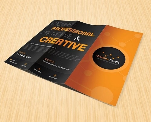
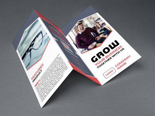
The Tri-fold Brochure is designed using an 8 ½ x 11 sheet of paper folding it twice creating three panels on each side. The reason it is called tri-fold because the entire sheet of paper is folded equally giving a feel of tri-panel.
Characteristics of the Tri fold Brochure

- It is designed in the vertical format for the proper usage of the space and flow of the content.
- It is the standard size that is pocket-friendly to the companies.
- It can be easily inserted in the #10 envelope for mailing and couriering purposes.
- It is quite simple in nature to be designed by a layman even on a word document.
- It minimizes paper wastage and hence is environment-friendly.
- It is usually opted by the small business owing to its economical cost.
- Even big business use the Tri-fold Brochure for mass distribution during trade shows, exhibitions, project, and product launches along with other such high traffic movement areas.
- It is effortless for storage purpose due to its small and standard size.
- With the tri-panels and bi-fold, the flow of content and information is seamless and easy to the eye of the reader.
- Any kind of paper can be conceptualized and printed in a tri-fold format.
Brochure design is a tricky concept with a lot of thought process and strategy goes behind in the conceptualization, using design elements, content flow, use of stock and actual imagery, and call to action details amongst other such crucial factors. With the Tri-fold Brochure having limited space and size to showcase the required information about the brand and its offerings to the customers, it needs to be designed intricately and specifically so that every detail is covered conveying the message to the readers.
Layout of a Tri-fold Brochure Design
The Tri-fold Brochure has is divided into the front and back side with the equal division of each side into three panels that are folded twice. It has a front, back, inside front panel, and three panels after opening including the one outside flap folding inside.
How to design a good Trifold Brochure?
Here, the explanation of the design process is supported by an example of the start-up company offering printed customized t-shirts for occasions such as marathons, dance competition, birthday parties, weddings, and more for the clear understanding of the reader.
1) Front Panel
The front panel of the Tri-fold Brochure should always showcase company name with logo, tagline, and product and service offerings in a short and crisp manner supported by the design elements that are carried forward in the rest of the panels. Being the first page to look, feel, and notice; the content and design should make a lasting impression enlightening the customer about the company and its products loud and clear without any ambiguity.
Example: The t-shirt brand should highlight its company name, logo, tagline along with talking about its offerings of customized t-shirts for various occasions ranging from birthdays to marathons.
2) Back Panel
It is the thumb rule of brochure designing that the back page should only highlight the call to action details that includes company address, contact number, website, and email address in the good font size for easy visibility. This page will generate the required leads and hence holds quite a lot of importance. Disclaimer, if any can also be a part of this page.
Example: The t-shirt brand should highlight all the call to action details in an evident manner to get good quality leads that is the entire objective of designing the Tri-fold Brochure.
3) Inside Front Panel
Now this page section is of the crucial significance as it is the first panel that gets turned after the front façade and sets the mood for the rest of the design and content to be followed. It can have testimonials from the customers with the support of actual imagery elevating the brand strength and value in the minds of the readers. The sales pitch starts with this panel luring the customers towards the brand’s products and services.
Example: The t-shirt brand should have actual images of customers wearing their t-shirts with the testimonials talking about what is their experience with the brand and the merits of the product purchased.
4) Outside back panel
Before talking about the actual offerings in the remaining inside panels, this panel rests side by side with the inside front panel and works as the perfect support system for the same. With testimonials on the LHS, the RHS side can talk about the features and attributes of the brand that gives it a competitive edge in the market.
Example: The t-shirt brand should highlight its merits and features such as best quality fabric used, on-time delivery, reasonable prices, various styles and colors available in the t-shirts, and other such aspects of the brand that makes them set apart from the rest of their contemporaries.
5) Inside two middle panels
It is recommended to combine the inside two middle panels for the designing and content purpose showcasing the product and service offerings of the brand. This section should talk about your company, brand as a whole, products, and services in a detailed fashion working as a sales pitch making the customers to make an inquiry.
Example: The t-shirt brand should make the full utilization of these two panels in the combined manner talking about their t-shirts, various occasions for which they design and manufacture; quality, areas of operation, delivery timelines, and other such vital business details. The content can very well be supported by the related imagery.
6) Symmetry
It is a must to maintain the design and content symmetry in the entire Tri-Fold Brochure with regards to the font used, headings, sub-headings, color palette, and the entire mood and flow of the brochure maintaining the design aesthetics.
7) Mock-up
Getting a mock-up or a dummy of the Tri-Fold Brochure is very important before giving it for the final print to check the margin space, color scheme, and the overall layout to avoid any discrepancies.
Though tricky, once the aforementioned points are considered whilst designing the Tri-Fold Brochure the results are spectacular and goal oriented.
Liked this post? Check out the complete series on Marketing
